When Vaidhee approached us, they weren’t just looking for a logo. They were building an Ayurveda clinic with a clear vision to offer authentic healing rooted in tradition but presented in a way that resonates with today’s premium, design-conscious audience.
Ayurveda, as a space, is often visually crowded. Many brands rely heavily on predictable elements, leaves, mortar and pestle icons, and overly traditional fonts, which can make them feel outdated or indistinct. Vaidhee wanted to break away from that. They needed an identity that still respected the essence of Ayurveda but felt refined, minimal, and trustworthy at first glance.
Our role at Advantage Marketing Solutions was to translate that vision into a visual identity that speaks clearly, confidently, and instantly.
The Challenge
The core challenge was balance.
How do you design something that feels deeply rooted in ancient wisdom, yet modern enough to appeal to a younger, premium audience? How do you communicate healing without falling into visual clichés?
Vaidhee’s target audience included urban families, working professionals, and wellness-conscious individuals, people who value authenticity but also expect clarity, aesthetics, and a sense of calm when interacting with a brand.
This meant the identity had to:
* Build trust instantly
* Feel premium without being loud
* Stand out in a saturated Ayurveda market
* Work seamlessly across both physical and digital touchpoints
The Insight
We realised early on that Vaidhee didn’t need to “look Ayurvedic” in the conventional sense. It needed to feel Ayurvedic.
That meant shifting the focus from decorative symbolism to emotional response.
Ayurveda is about balance, harmony and restoration. So instead of representing it literally, we chose to express these qualities through form, spacing and visual tone. The goal was to create a brand that feels calm the moment you look at it.
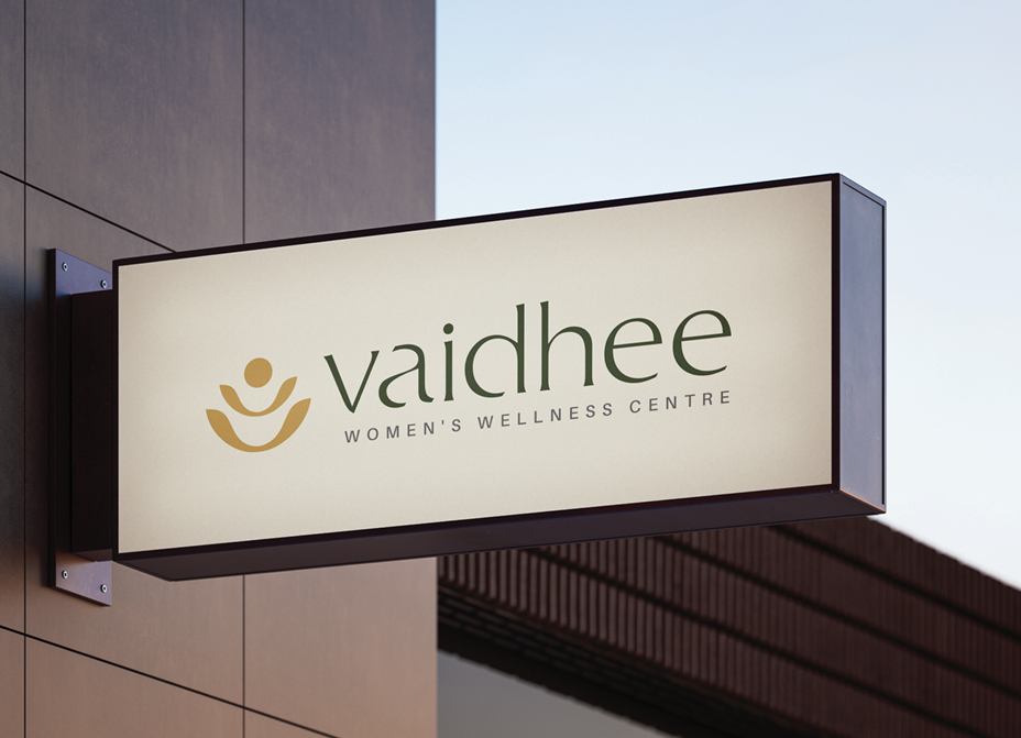
The Logo Approach
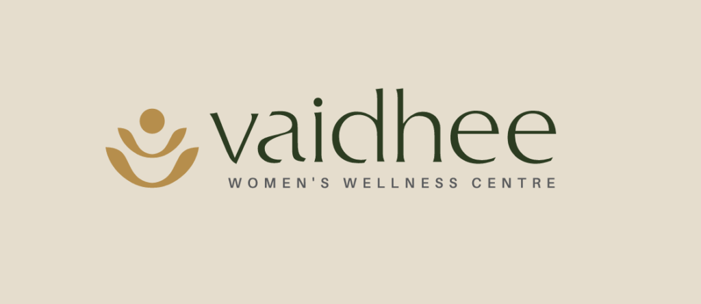
The logo was designed with a minimal, intentional structure.
We explored forms that subtly represent balance and alignment, drawing from the philosophy of Ayurveda without making it obvious. The result was a mark that feels symmetrical, grounded and composed.
Typography played a crucial role. We chose a clean, modern typeface with soft edges, something that feels approachable yet refined. It avoids excessive ornamentation, allowing the brand to feel contemporary while still carrying a sense of warmth.
Every curve and spacing decision was deliberate. Nothing was added for decoration, only for meaning.
Colour Strategy
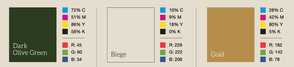
The colour palette was kept earthy and calming, but with a premium twist.
Instead of bright greens typically associated with Ayurveda, we leaned towards muted, sophisticated tones. These colours evoke nature, but in a more understated and elegant way.
The palette was designed to:
* Create a sense of trust and calm
* Feel easy on the eyes across environments
* Work consistently across print, interiors and digital media
The overall effect is subtle luxury, a brand that doesn’t need to shout to be noticed.
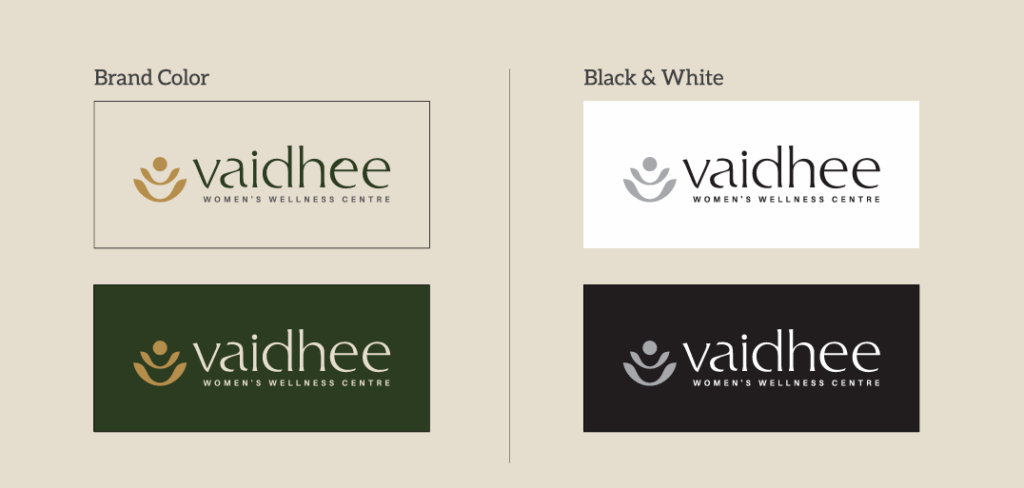
Brand Language & Extensions
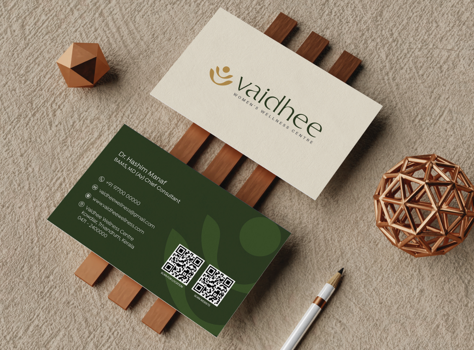
Beyond the logo, we built a cohesive visual language.
Layouts were designed to be clean and spacious, allowing content to breathe. This reinforces the idea of calmness and clarity, something especially important in a wellness space.
Imagery direction focused on authenticity. Instead of overly staged visuals, the brand leans towards natural, real moments that reflect care and healing.
Typography hierarchy, spacing systems and graphic elements were all aligned to maintain consistency. Whether it’s a clinic board, social media post or brochure, the brand feels unified.
Positioning the Brand
The strategy was clear: position Vaidhee as a premium, trustworthy wellness destination.
Not overly traditional. Not overly modern. But a perfect intersection of both.
We avoided aggressive marketing tones. Instead, the communication style is calm, confident and reassuring, mirroring the experience one would expect from the clinic itself.
This positioning helps Vaidhee stand apart from competitors who often rely on louder, more cluttered branding.
Impact
The final identity gave Vaidhee a strong and distinctive presence.
It immediately communicates:
* Professionalism
* Authenticity
* Calmness
* Premium quality
The brand feels timeless, not tied to trends, but built on principles that will stay relevant.
More importantly, it connects with the right audience. People who are looking for genuine Ayurvedic care, but also expect a certain level of refinement and clarity in how it is presented.
What Made It Work
At Advantage Marketing Solutions, the success of Vaidhee’s branding came down to restraint and intention.
We didn’t try to overdesign. We didn’t rely on obvious cues. Instead, we focused on what truly matters, how the brand makes people feel.
By stripping away the unnecessary and focusing on balance, clarity, and elegance, we were able to create an identity that feels both rooted and relevant.
Conclusion
Vaidhee is a great example of how thoughtful design can transform perception.
In a category filled with visual noise, a calm and minimal approach becomes the strongest differentiator. The brand doesn’t compete by being louder; it stands out by being clearer.
This project reflects our belief that strong branding isn’t about adding more. It’s about choosing what to keep and executing it with precision.
For Vaidhee, that meant creating a logo and identity that feels effortless, premium, and deeply aligned with its purpose.
And that’s exactly what makes it memorable.