
Quality Innovation
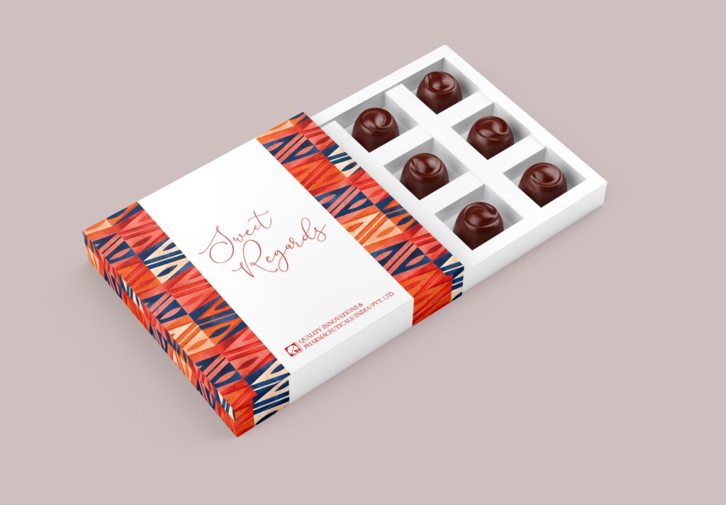
For Quality Innovation, the approach was rooted in clarity and trust. We designed the packaging to feel clean, precise, and highly structured, reflecting the reliability expected from a pharma brand. A balanced use of white space, clear typography, and a systematic layout ensures that information is easy to navigate while maintaining a professional look. The […]
TeaRoute
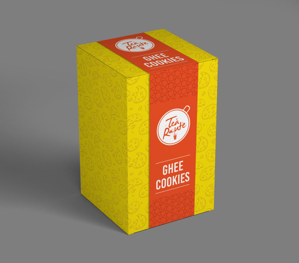
With Tearoute, the focus was on slowing things down. The packaging was designed to mirror the calm and ritual of tea drinking, using a minimal layout, muted colours, and clean typography. Each element was thoughtfully placed to create a sense of balance and clarity, while still allowing the product to stand out. The result is […]
Crunchizz
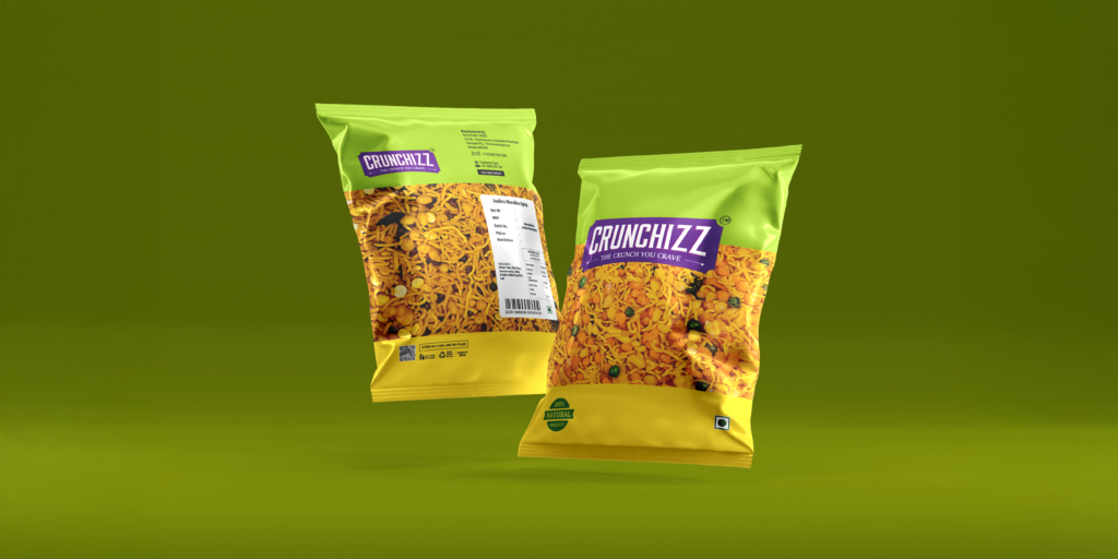
Crunchizz called for something energetic and instantly eye-catching. We built the packaging around bold colours, sharp contrasts, and expressive typography to match the brand’s playful personality. There’s a sense of movement and spontaneity in the design, almost mimicking the crunch and excitement of the product itself. It’s designed to stand out on shelves and feel […]
Bun Cafe
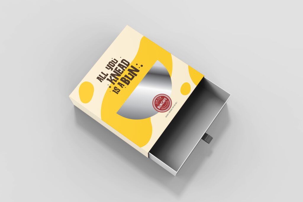
With Bun Cafe, the goal was to capture a sense of fun, comfort, and everyday indulgence. The packaging leans into warm tones, quirky elements, and a casual visual style that reflects the café’s easygoing vibe. Playful typography and light-hearted graphics bring personality to the brand, making each pack feel approachable and relatable. It’s designed to […]
Bayroute
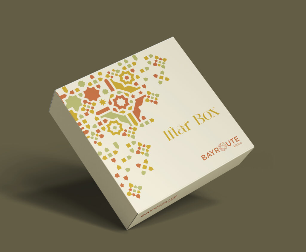
For Bayroute Bistro, we took inspiration from rich Middle Eastern aesthetics and translated them into a modern packaging system. Intricate patterns, deep colour palettes, and elegant detailing come together to create a sense of authenticity and premium appeal. At the same time, the layout remains clean and structured, ensuring it feels contemporary. The packaging extends […]
Alchemeal

For Alchemeal, we built the packaging around the idea of transformation, turning simple ingredients into something special. The design balances a modern, slightly experimental feel with strong food appeal, using bold visuals and structured layouts to highlight the product clearly. Cool tones and clean compositions help reinforce the frozen category, while subtle detailing adds a […]
Muffin House
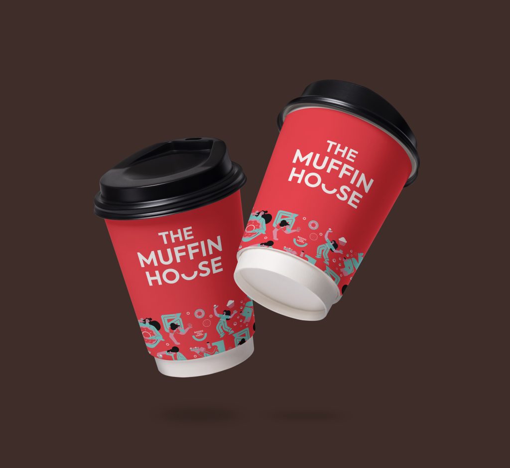
For The Muffin House, the packaging design was all about bringing the brand’s warmth and quality to life. Each package was thoughtfully designed to feel inviting, premium, and unmistakably on-brand, while still being practical for everyday use. From colors and typography to layout and finishes, every detail was chosen to make the product look as […]
Ambrosia
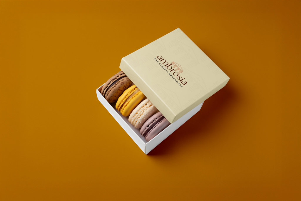
Ambrosia’s packaging was designed to feel indulgent yet understated. We focused on a refined visual language with clean compositions, subtle textures, and a restrained colour palette that speaks of quiet luxury. Every detail was carefully considered to create a sense of sophistication without overwhelming the product. The end result is packaging that feels timeless, elegant, […]